
Does this sound familiar?
You fire up your favorite streaming service to watch … something. Soon you’ve spent several minutes (or half an hour, or more) browsing a huge selection of content without actually watching anything.
This experience isn’t great because:
I knew I could do better, so I designed Moodstream to help users answer the question “What do you feel like watching?”
To highlight Moodstream’s unusual approach to streaming and evoke the era of cable TV, I chose a quirky brand and visual design elements inspired by SMPTE color bars, mood rings, Lite Brites, and rainbow scratch art.

Space Grotesk is the retrofuturist display typeface here. One cool detail: the capital D’s prominent unbracketed slab serifs aptly make it stand out in the “Different” heading.
Highly legible, neutral Acumin Pro dials Space Grotesk’s loud personality down to a comfortable volume and doesn’t compete with it.
This pairing works because the font skeletons line up well; both typefaces have curved “R” legs, flat apexes, diagonals that meet at the baseline, and short descenders.

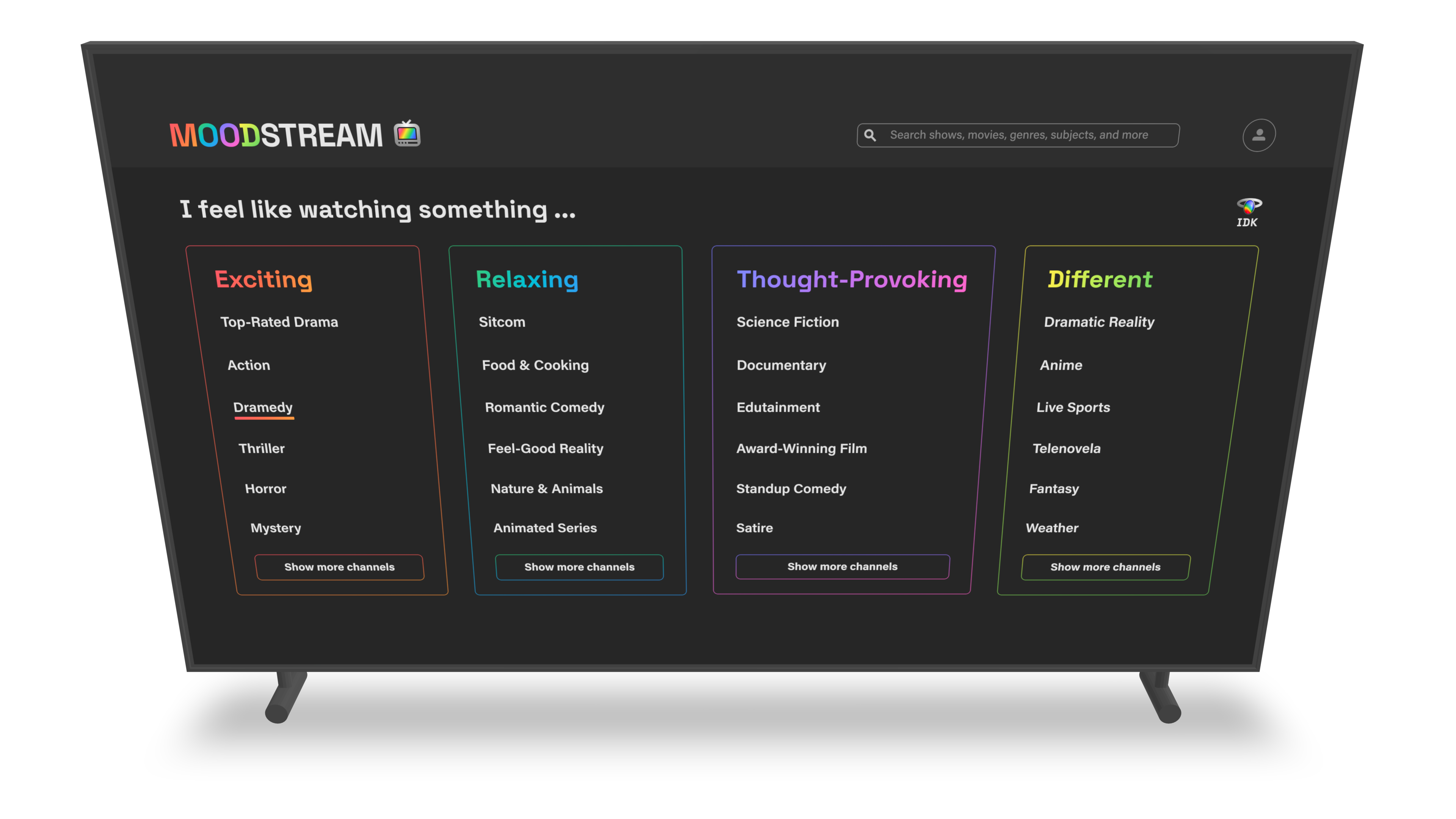
Like most of its would-be competitors, Moodstream has a dark interface that helps the content’s high-quality imagery to shine, but its rainbow of gradient brand colors sets it apart from the crowd of single-color streaming brands and draws attention to the four moods at the heart of its user experience.

Moodstream’s four moods alleviate decision fatigue by reducing the number of options presented to users who are deciding what to watch.
Users who have a general idea of what they want can skim the moods and channel lists, which offer an intentionally limited set of options.
If users truly have no idea what they want to watch or are tired of thinking about it, they can use the “IDK” button on the home page to watch a random channel.


Moodstream’s responsive design allows users to find and stream content at all sizes from TV screens to smartphone screens.

With the UX goal of reducing decision fatigue in mind, I needed to design a search experience for users who have a specific idea of what they want to watch, like a particular title or genre. I tried a few different search result patterns before landing on one that worked well:
My solution uses a grid of small content cards displaying relevant titles. A user who searches for a genre or channel name like “Comedy” can hover over each of the four headings to highlight titles appropriate to that mood and then click either the play button next to the mood category heading (to begin watching a channel that includes the highlighted search results) or a card (for a content details modal that offers the option to begin watching a specific title).

This project taught me the value of iterating quickly and pushed me to make it a habit. I learned to create a shorter feedback loop by taking a break or doing another task for a little while so I can evaluate my iterations from a more distant perspective before iterating some more.
For example, Moodstream's retro TV logo required several iterations—simple, detailed, black and white static, colorful static, SMPTE bars, and so on—before I arrived at the final version, which uses both a diagonal brand rainbow gradient on the TV screen and and a radial gradient that gives the body of the TV a subtle silver sheen. This combination keeps the logo from feeling either too flat or too busy to work well with the typography.
Just click the button below and tell me about your design problems, goals, and wildest dreams. Even if you don’t hire me, you’ll meet a good listener with a curious mind and a unique perspective.

Drop me a quick line and I’ll reply within one business day.
Imagine what your team can accomplish when I join it. If you give me a chance, I could be your best hire ever.
All you need to do is reach out.
... Oh, you’re still here! You’re a rare one, truly; I’d love to meet you. Why don’t you click this button?
